Thursday, July 26, 2012
Eye Know
LOGO

EYE KNOW is the name that Meagan and I chose for our product. The logo represent an image of an eye because eyes are like the brand image of our product. The text above the logo acts as eye lashes while the diamond inside the eye ball means wise in the tribal language.
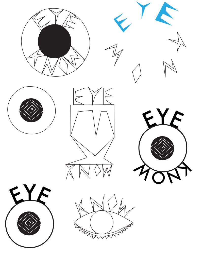
These are some of the logos that I've design but was not chosen for final.
ANALYTICAL DRAWING

PRODUCT PROTOTYPE
My partner and I came up with four types of eye in order to make sure that every pieces can be worn and will not permanently stay on the necklace.


PRODUCT POSTER

Wednesday, July 25, 2012
product design

PRODUCT STATEMENT
My partner and I have produced a statement jewelry piece which have a symbolic connection to your emotions. This necklace was crafted with some of the finest stones in the world. Giving it a natural quality while keeping a high quality piece. Using hand woven silk combied with such beautiful gemstones varying by design. You can combine a piece that is naturally beautiful in even way. We made this piece so that the wearer along with the people surrounding can understand the emotions of someone without saying a single word.
Design Process


MATERIALS
TURQUOISE
Turquoise is an opaque, blue-to-green mineral. It is used in several parts of the product; the background of the eye, the surrounding circle, etc. Basically, turquoise is used in almost every blue-green parts of the product as it has so many shades.

QUARTZ
Quartz is an abundant mineral in the Earth's
continental crust. It has a clear, natural white color which
fits perfectly to the white part of the eyes.

WULFENITE
Wulfenite often found as thin tabular crystals with a bright orange-red to yellow-orange color. The background of the product contains a lot of yellow shades, therefore Wulfenite would be a very useful stone as the shades are so widely ranged.

Venn Diagram
getting together with Meagan Davis

Talking about our event, we came up with the differences and similarities of our event. We place them in each section of the venn diagram.
Unarmored Drawing
what if you got salted?

After I made a garment that will prevent me from getting harm by the sea creatures, the following project was about what will happen to me if that garment was not present at that time.
Research is the first thing I did as I have no idea what an anatomical structure is. I basically typed 'anatomical structure of sea animals' into google. And this image is the source of my inspiration for this piece.

This is the anatomical structure of an urchin, which is a small, spiny sea animal. Their shell, or "test", is round and spiny, typically from 3 to 10 centimeters. They are very sharp and fine, it will give the person a rapid long sting if he or she stepped on them.
Visually the urchin looks painful itself without doing anything to it, so I use this idea as a starter. My event is about the contrast between pain and beauty, now that I've got the pain, I have to search for the beauty. I think about what element will weaken the pain. Waves are the thing I came up with.
PAINTING
After I have chosen the figure I want to work with, I transfer it onto an illustration board.
Then I start placing the outline of the urchin in several places of the body. When I'm satisfied with everything, I apply acrylic paint onto my drawing.
PROCESSES


Before I apply paint on top of the sharp urchin, I explore the color by using a tracing paper first in order to make less mistake
Figure
Sumi ink is the media I chose to work with. I love the darkness of the stroke and how the tone changes by just mixing the ink with water.


Monday, July 16, 2012
Design Review
MARNI

I love this garment. I think it is simply elegant and cool at the same time. The brightness of the upper part of the dress seems to be so vibrant that the model needs to wear a sunglasses. I think the darker color of the lower part did a great job of minimizing the brightness of the garment. However, even though lower part is very dark, it did not took over the upper part of the garment.
The cutting and crafting of this garment is very, very clean and neat. This makes the garment look even more elegant and powerful. I love how the garment look very block-liked shape but does not look too big on the person wearing it.
The shininess of the lower part of the dress gives a little bit of playful character to the garment. But even if it is not shiny, I think it will still look awesome.
Fashion fashion fashion
THE MET
ARMS AND ARMORS
I love drawing these arms and armors a lot more than drawing clothes made by PRADA and SCHIPARELLI. I got fascinated by the textures and details in the glaives.


ARMS AND ARMORS
I love drawing these arms and armors a lot more than drawing clothes made by PRADA and SCHIPARELLI. I got fascinated by the textures and details in the glaives.


PRADA & SCHIAPARELLI
even though I don't like sketching clothes, but the expedition was amazing and I got fascinated by them. I love both Prada and Schiaparelli clothes.


Desatled
DESALTED

INTENTION
My intention for the garment was to make a garment that will protect the me from the annoying sea creatures in the Maldives. In order to do that, I have a thought about how to become unnoticed in the ocean. That was when the idea of being camouflage came up into my mind.
I based all the colors of the garment with the colors of the ocean, otherwise I won't be able to camouflage and would surely got distracted by the creatures again.
SUCCESS/EDIT
I think the most successful part of my garment was the trouser, especially the pattern that I stitched on them. It took me two whole days to do those pattern. At first I thought it would be simple and would be quite easily to do. But in reality, it was very time consuming. I ran out of thread for 3 times which is very annoying.
I would like to edit my top a little bit - just to make it cleaner and have nicer edges. This goes to the trouser as well. Also transition. The transition from my top to my trouser is still an issue I have to think about - I could elongate the top a little bit just enough to full the empty space between the top and the trouser.
I would say that the trouser is my strongest part of the piece. Reason for that is just because I like it more than the top.


EXPLORING WITH PAPER + DESIGN
Before going onto making the real garment, I had a play with colored paper in order to give me a sense of how paper works.

MOOD BOARD

Sunday, July 15, 2012
Impossible conversation
IMPOSSIBLE CONVERSATION
I would love to have an impossible conversation with Egon Schiele. I love, love, and love his drawings.
Schiel was known for his contour drawings.
I love contour drawings. In my opinion, contour drawings are a lot more interesting than a normal drawings. It seems to have a meaning behind the drawing, unlike normal drawing where you can know straight away when you look at it.


By looking at his works, it influenced me to draw in a contour style in numerous ways. This makes me become more creative and allows me to do something I never think I can.
Thursday, July 12, 2012
I'm Salted, are you?
FINAL BOOK COVER

EVENT TEXT STUDY
design process

FINAL
design for event text study

BOOK COVER
design process

This is my first book cover - not the final
there are not much changes between this and the final. For the final I just increased the size of the title and move them up a little bit.

From grey to color
COLOR/BW PALETTE


JOSEF ALBERS
In this piece, I cut copies of Josef Alberts' work into little pieces. Then glue them based upon the shade of each piece - white to dark

Turning abstract
FINAL

Acrylic on canvas;
Sharp edges and lines are the gadget of my piece as I think it can represent the word painful quite well. Other than that, the piece must be done using only black and white colors, therefore I think by using simple shapes would be the most relevant.
DESIGN PROCESSES
chosen abstract word - painful


As salt shifted to graphic

Acrylic on illustration board;
When I think about things that are related to my event, salt is the first thing that came right up into my mind. This could be because almost every time I went into the sea I have to swallow at least one mouth full of sea water, which I have no idea why. I did not take a picture of salt because that would be way too boring. Instead, I had a play with them; I add colors into it to make it looks more interesting and to look more ocean-like. After that I just randomly scrub the colored salt onto my hands and took a picture of it. I tried to make the actions look the most painful as I can.

some collected images

PALETTES

Subscribe to:
Posts (Atom)